Oh no! I have been so caught out. Where’s the time that I need to calm down and formulate a response to all the visual goodness that has come our way? I haven’t even been able to reply to all the comments on recent posts, nor on the e-mail support I have received bts, nor have I been able to get the auction preparations done. Richard – you are to blame. Can you tone your Daniel Miller/Hot Dad hotness down a little bit please? Actually, don’t. It’s quite alright…
So, in order to be topical, I am “re-grouping”. That Berlin Station ensemble trailer is just fantastic. And while I am unfortunately neither knowledgable nor bothered enough to gif the scene for your or my pleasure (plenty of other gifted giffers have already done the dead), I might just take a look at the imagery that has just been released to back up the trailers. Here is an *ooof* of sorts, my submission for Day 4 of Armitage Week. It’s been a while since I have written one of those, so I am a bit rusty. Bear with me.
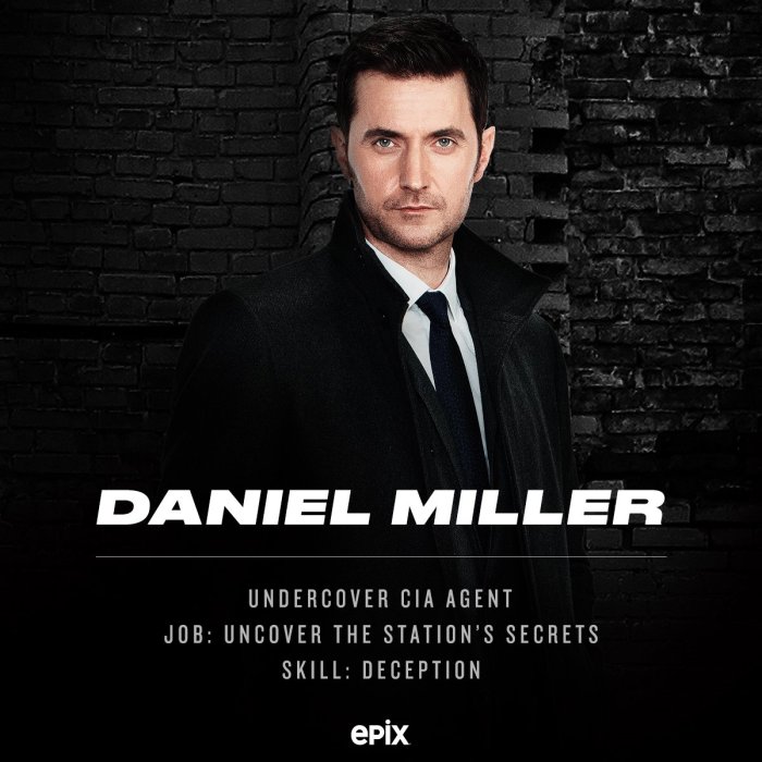
Richard Armitage as CIA agent Daniel Miller. Promo material for Berlin Station, Epix
A new promo image-cum-graphics courtesy of Epix. Undercover CIA agent Daniel Miller reports for duty. Well, or rather: is given the quick intro. We have Daniel Miller all formal in coat, tie and white shirt. The classic “man in black” get-up. If you are thinking “Blues Brothers”, you are in the wrong film, guys! Miller looks straight into the camera with his body turned away at a slight angle, (his) right shoulder forward. Not only is this a half-length portrait, but due to the graphic design the lower part of Miller’s torso is obscured by the lettering as well as by a fading effect. Behind Miller is a rough brick wall that appears in b/w while Miller himself is pictured in colour.
With his collar secretively pulled up, Miller already conforms to the stereotype. (Is there a reason why spies always hide their necks? Unsightly thyroid problems? Or is there an internal memo that field agents are obliged to wear their coat collars up. Cf. also corresponding image of field agent Hector deJean HERE) But the poster is trying to keep interpretations open for us. Instead of showing Miller in a pose that signals secrecy and surreptitiousness (again, cf. deJean), he is not fully turned away from the camera. And his face, the most important part of this image, is captured straight-on – which suggests a certain openness and honesty, underlined by the wide-open gaze suggests the subject has no need to hide anything.
Armitage, I would argue, is perfectly suited for the role of a spy. No, that is not just fangirl bias. I am also basing that on the often-mentioned mystery of his facial expressions. This picture – to me – is a case in point with the ambiguous facial expression. Miller does not smile as such. His mouth is a straight line, no smile playing on those spylicious lips. His eyes, however, tell a slightly different story. Ambiguity reigns when it comes to those blue peepers. I see the merest hint of a smile, particularly when I obscure the lower half of his face. Do the test and place your fingers across his face – it’s not an aggressive gaze, nor is it secretive; it almost feels like a smile. Perfect for a spy whose attitude is carefully hidden behind a mask.
And thus Miller remains a mystery – especially when combined with the text that has been superimposed on the image. His job: uncover the station’s secrets. His skill: deception. The main tool of a spy, one could argue. And yet deception works all ways – what is *he* hiding while he is trying to uncover other people’s secrets???
On the graphics used in this design – ok, the fangirl in me is not happy. Of course not – anything that obscures any part of my favourite actor is to be rejected. Aesthetics are a tricky subject. Whether they appeal or not, is often based on personal associations and preferences. My spontaneous verdict is that I am not mad about the graphic design. There is something about the italic bold font used for “Daniel Miller” that screams “Grand Theft Auto” to me. Not that the font looks anything like GTA, but this italic looks as if it is missing a few exhaust fumes behind the “R”. Moreover, I notice that this is not the same font as the one used for the main BS poster, and neither is the smaller writing underneath. I can only assume that the decisions were deliberate – although I wonder why the designers did not go for an organic, uniform look in their promo designs.
Finally, the background – the rough brick wall, I wonder why the brick imagery keeps making a comeback in the Berlin Station design. This may be my “insider knowledge” as someone who is familiar with Berlin, but brick walls are not all *that* ubiquitous in Berlin that you would associate it with the city. Ok, they connote roughness, destruction, imperfection, edginess, possibly non-conformity by way of associating run-down squats that Berlin hipsters may be living in. Maybe that is a hint that I cannot yet place in any context, apart from assuming from previous trailers that show Miller antics on Berlin rooftops and dodgy corners. But I don’t quite get why brick walls are so integral to Berlin/Station that they continue to pop up in the promo imagery. It may all be a mere aesthetic choice – because “texture” is a way of creating focal points on different layers of a composite image – but in that case the choice of background picture is not ideal due to the irregularities in the wall structure (different brick textures, protruding wall remains).
I do not particularly like that the brickwork is obviously a b/w image while the subject in the foreground is in colour. Don’t get me wrong – I love b/w. But I abhor b/w vs colour contrasts in a composite image. It’s a fad that has long passed, and personally, I just find it pointless when it doesn’t carry any clear meaning. Moreover, it does not mirror reality – we cannot selectively see b/w and colour at the same time. But ok, could be an artistic device.
What’s most distracting for a pedantic picture viewer like me, however, is the obvious lighting on the subject that does not match the lighting of the background image. Miller is illuminated from above front right (our POV), as well as lit from slightly behind and to the left and right of the sitter (indicated by some of the highlights on his cheeks, just above the stubble). Yes, it nicely illuminates every part of his face – but it does not match the blasted background *at all*. That is a total pet hate of mine – when it is more than obvious that background and foreground are two completely independent images that were produced separately. It simply does not convince me – it distracts.
 But this wouldn’t be an *ooof* if I didn’t like the image deep deep down in the farthest corners of my soul. Of course it appeals – it has been composed in a deliberate way that becomes clear when you add a few helping lines in the image. Note how Daniel’s right eye has been placed pretty much exactly on the exact vertical middle of the picture (thin red line). Hardly a coincidence.When checking “the rule of thirds”, the head of the subject is in the mid section of the top three squares – a pleasing composition in a square-format image. Likewise, the main text – the subject’s name – is exactly on the lower third line. This allows the image of the sitter to take up two-thirds of the total size of the image, with the text sitting in the lower third. Textbook! It doesn’t work quite perfect when looking at the verticals – but even despite the angled shoulders the body of the subject sits still pretty much in the middle of the image. Thus, the subject is bang in the middle of the image – and our in-built sense of symmetry loves that kind of composition. It is balanced and calming – an attempt by the image makers to influence our perception of the subject??? My only gripe in terms of composition comes from the backdrop whose vertical lines do not correspond with the rule of thirds. (But admittedly, one could argue that rules are there to be broken – and to add a bit of unexpected tension into an otherwise fairly symmetrical
 = boring??? composition.)
With all my niggles re. the somewhat unrealistic black brick backdrop, the dark tones provide a backdrop from which the face of Miller really stands out. Armitage’s eyes are like magnets, drawing my gaze and my curiosity. The hint of pout on the line of the closed mouth create a tension between soft emotionality and ascetic performance of duty. Who is this man? Is he a good guy or a bad boy? And let’s face it – I’m attracted to either alternative. Oh, I can already see how Danny Boy will be a master manipulator, a persuasive seducer of women and a relentless pursuer of suspects…The mixture of assertive and open, the ambiguity of the expression makes for a titillating gazing experience. And leaves plenty of opportunity for imagining what Daniel Miller will be like, especially when he is not involved in “deception” but in “sexual intrigue” *bows to Michelle Forbes* :-D. What is it in Daniel’s dark past that may compromise him???
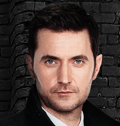
Good excuse to insert close-up of Armitage… eh… Miller
I’m sexually intrigued, indeed. Pedantic niggles with fonts and textured backgrounds aside, I mostly like what Epix has produced so far. This character promo certainly appeals to me more than the official poster of the series that imo obscures Miller’s face with the brickwork texture. Don’t tell my photographer friends, but the real gem is the ensemble trailer that merely uses lighting effects to create the eerie, suspicious feel of danger and intrigue that a spy show embodies.
So simple and yet so effective – darkness and light, connotations of interrogation lamps, dark corners and the flicker of searchlights. This is a real gem. Intrigued indeed.


Pingback: Guylty *ooofs* again for the first time in yonks | Me + Richard Armitage
re: bricks — I don’t associate brickwork with Berlin but I do associate rubble with the city.
LikeLike
That is a good point. I had not thought of that.
LikeLike
I believe that the Twitter header graphic is an homage to the murals and street art one finds all over Berlin… Just a guess from the photos the cast posted, and from looking into Berlin’s street art.
LikeLike
Definitely another interpretation, yes. They were very much into the murals in Berlin…
LikeLike
really love this picture and love your article on Daniel Miller(Mr. Richard Armitage),I feel the same way, is he good, bad, or what. i have this feeling that he has a split personalityand that he is the leak or he has a twin (played by Mr. Richard Armitage) with maybe a few different features. also what i like about this picture is when you look at it his right side is a little dark(evil side) and when you look at his left side it is light(good guy side)
LikeLike
Glad you like my photography related musings, angel. It’s not my favourite ever image, but it does the trick.
I have been wondering, too, whether Miller is deeper involved in the leaks than just visiting Berlin to clean up the operations. Well, that’s what they want us to think, I suppose. They’ve been dropping hints that he hides a secret himself.
Good point about the remains of a bit of shadow on his right and the light on his left in the image. They are more effective with that kind of light-play in the ensemble trailer.
LikeLike
This Oof is over due!
LikeLike
IKR. I just checked, and it is 13 months since the last *ooof* (on Chop). That shows you a) the small (non-existent) number of new pro photos we have seen in the last year and b) my own lack of impetus in that direction. Too many selfies… *grins*
LikeLiked by 2 people
Some selfies I like, others, should have found the delete or the no share folder. But I think we all have one of those. The boy rarely takes a ‘bad’ picture. Just sometimes…. y’know?
LikeLike
Well, he’s a good-looking man, and the camera loves him. Even on the iPhone, so his pictures always look pretty good – with only very few exceptions.
LikeLiked by 1 person
I like your oofiness, but I don’t care for his face in this photo. It looks like a combination of a photo and someone’s artistic rendition. To me, he doesn’t look quite as handsome as he can do, or is, and maybe it’s the frontal angle. But, to answer your question, spies must keep their collars up at all times so the opposition doesn’t notice those hairs on the back of their neck standing up. I haven’t been to Berlin, so I can’t speak to whether brick buildings there have any significance ( older parts of the city maybe?) They certainly give a grittier feel to the environment. Or maybe just a metaphor for building the case, solving the mystery, brick by brick.
LikeLike
You are touching on an important point – the whole thing is heavily photoshopped. There is an artificiality to the face – even though they left in some of the eye wrinkles. I was under the impression that he was heavily made-up in this shoot. (Thought the same about the ensemble trailer.)
Haha – hairs on the back of their neck.
I like the association with “solving the mystery” and “building the case”. That had not occurred to me.
LikeLike
Gotta come back to read more in-depth, but I love the pic…his expression, the palette (I’m a dark soul who loves dark colors. .lol) and even the brick. His pale skin against the black makes my eye focus on his gorgeous face. I like your interpretation of the meaning of those bricks too, Perry. I do take issue with it being off center(despite the rule of thirds)…if they were truly going to make it fashionably or artistically off center, it had to be over to the right more. If not, just line the darn thing up, people! I’m glad he seems to be playing a shady “baddie.” We’ll see!
LikeLike
I quite like black on black pictures, too. In this case, the texture puts me off, though, I have to say. But yes, it always nicely sets off the skin tone from the surrounding backdrop.
The off-centreness is definitely a turn-off. I just think that the particular choice of stock photo of the brick wall is not particular good. They could’ve chosen something better.
Not sure yet whether he is a baddie, but shady character, definitely! I would have thought that the lead character in a show *must* be good in order for the audience to identify with him – and in order for the show to have a potential future beyond a first season.
LikeLike
From a non fan girl, casual observer, this photo as with most of the Berlin Station ones I’ve seen thus far are a little too photo shopped. What stood out for me in this photo is that his lips look super thin.
Also, sexual intrigue with Michelle Forbes. Really?
I recently received a request for the entire set of BS plushies. I said sure, but will not make Forbes’ character ;D
LikeLike
Plenty of photoshop, fangirl or not. I guess that’s to be expected when it comes to glossy, high-profile show promo. (And that doesn’t mean I like that – I prefer imagery to be realistic.)
Re. sexual intrigue – no, not explicitly with Michelle Forbes. I referenced her because *she* is the one who mentions that there is “plenty of sexual intrigue in Berlin Station” (in the trailer interviews). She doesn’t say who with whom, and I doubt it would be Miller and Valerie Edwards. Hollywood is too ageist for that kind of pairing. Miller is going to have it on with some hot young ‘un.
You sure you won’t make Forbes’ character? You could have some very cheeky fun with that… 😉
LikeLike
Umm, no.
I am looking forward to making the mohawked plushie. 😀
LikeLike
Who is that again?
LikeLike
The dude with the brown hair , next to Danny Boy
LikeLike
Oh, yes, of course. Rhys Ifans aka Hector deJean. Acquired taste.
LikeLike
I thought the wall was really behind him, that it was painted black and Daniel looked like he was standing in front of it when he was caught in the spotlight (kinda/sorta). I think the BS people use background bricks because so many people associate Berlin with the wall and bricks subliminally remind them of it. I know most of it wasn’t made of bricks but I think that’s what Americans picture when they think of it. Maybe because of newsreel footage of people bricking up windows bordering the wall.I think he looks great in the pic.Nice hair and no stubble. A nice change. I agree with your opinion of the font. Maybe he rides his bike fast and furiously. 🙂
LikeLike
Again, another brick interpretation that I did not think of, yet it really makes sense. Particularly the bricked up windows. And *duh*, I was looking at a lot of footage about the building of the wall last week (it was the 55th anniversary of the building of the wall on the 13th of August) – and they showed the windows in Bernauer Straße being bricked up.
Fast and Furious: Cycling Edition, featuring Daniel Miller. LOL.
PS: I am quite happy about the Miller look otherwise – stubble and spiky side-burns, give me more.
LikeLike
I have missed your *ooof’s*. I have been great to read a new one from you. Thank You!
LikeLike
Hello Katie!!!!!! Long time no hear. Good to hear from you too xx
LikeLike
Aaah, so glad the *oooofs* are back. And did I told you, that I am a massive fan of the helping lines? Ehrlich! 😆
LikeLike
I like those helping lines, too. It’s always interesting to see what graphic idea is behind an image. The gaze lines are even better, though, when you follow the eye on its journey across an image…
LikeLiked by 1 person
i’ll ever forget those lines in that Glamour shot, up and down and up and down and up and down, i never got tired of the journey!
LikeLike
🙂 That was a particularly good example. And yet, of course it is subjective in its own way – may not work like that for everyone. Next time I write an *ooof*, I’ll try and do a gaze line graphic again. They are fun to chart. But they actually need a certain type of image for them to be interesting.
LikeLiked by 1 person
yes, we need more shoots, more that involve just full frontals.. to make more of his.. assets
LikeLike
Loving the “ooof”! I’ve really missed them and the pics made me gasp – especially the crop! 😉 Oh those eyes!
LikeLike
Hehe, that crop is fully functional as is – we don’t need no letters that explain who it is. Reduced to the essentials – the face.
I really should do more *ooof* posts. There are a few images that have piled up, thanks to that promo weekend in LA. I’d like to do more photography posts, but I find them time-consuming – and I have so much less time on my hands these days 😦
LikeLiked by 1 person
I always enjoy your “ooof” posts and I amazed myself how much I learned from your photography ones. You showed me a whole new way of looking at pictures. I have a grandchild about to enter her last year of High School who is really into photography. I hope she pursues it in years to come.:)
LikeLike
I am glad if you can find more in the *ooof*s than just the ogling material 😉 That’s the sweet reason to read (and write) them, but I love passing on a bit of passion for photography. I hope your granddaughter takes as much pleasure from photography as I do – it’s such a wonderful creative pursuit, and thanks to digital photography it has now become much cheaper.
LikeLiked by 1 person
I quite like the blackness of the image. I thought the bricks were painted black until you pointed out that it was in black and white.I think his face is a little too photo-shopped but what bothers me most is the way the texture of the bricks change at his shoulder creating that line down the side of him at the 2/3rds point. It looks like the image should have been cut off there. xx
LikeLike
Black is good, I agree. I like him wearing black, and even against a black backdrop that can look stunning. In this case it really is the annoying brick texture that puts me off. You are so right – that protruding bit of the brick wall ruins it for me, too. The vertical lines are distracting.
LikeLike
Ode to Bricks
Daniel stood next to some bricks,
Thanks to some photo -shopped tricks.
Looks like he got down from the roof,
And inspired a rare Guylty ooof.
We know this spy could keep his cool,
Even while wading through fan girl drool.
But his courageous heart beats with dread,
He shares air dates with the Walking Dead.
Kathy Jones
LikeLiked by 6 people
*claps enthusiastically* A wonderful gem – particularly the punchline. I had no idea!!! They are up against WD? Oh-oh. But yes, this spy is cool!
LikeLike
Well, they are sharing Sunday nights. I do not know if they are on at the same time yet. But I hope not. For Daniel’s sake.
LikeLike
Interesting pic. Sort of artwork-y and poster-y, but utterly arresting.
Great ooof, as well. Thanks, Guylty. I love all the details of how it works.
LikeLike
Close ups are always appreciated! Great post! 😀
LikeLike
As long as they supply us with nice images, there will be more 😉
LikeLike
i loved the quick trailer or what should be call it, clip? 6 spies, infinite lies – clever and the whole light play! And they all seemed to have real expressions in their faces even if we could only glimpse them unlike all the rest of the photos which have surfaced which were rather blank. It was like a breath of fresh air to finally get some feeling into them.
I had a little snigger at ‘deception’ .. sorry! I wouldn’t have spotted the fonting until you said cars and then i had it, it is totally Top-Gear-ish! Meh indeed, especially since the font on the poster or shall we say artwork i really liked. I would have gone for either that or the font for text on staff dossiers 🙂
And yes the wall at the back, hm it really bothers my brain when i look at it that there is no shadow! clear indication of photossssoping and not clever in this case as shadows would have been nice with this theme.
What i really like about his pose is the shoulder position which makes them look strong and wide! I know they are but they look it even more like this 🙂
I know he is caked up in make-up but i still find those lips lush, i look at those and i lick mine, it’s unavoidable.
The eyes are great, observant, alert, open and mysterious at the same time. It’s in the wepage, the individual files, Miller’s first spy assignment was with deJean so there are secrets there, which should be interesting to uncover. From what i read in those files i suspect little change of amorous entanglements for Miller, however plenty for the others it seems. But of course they could keep this as very secret so who knows!
I love his face and those cheekbones, pity the full on light makes it look wide when we know it is anything but.
I think Kathy or somebody said it, that although the photo is striking we know he is even more handsome than this. Weird , i don’t know what it is.
Oh and in the other trailer, i totally got Francis-shivers all over when he looks to the side! eeeek! (please don’t be a baddie, please don’t be a baddie, please don’t be a baddie… you can have flaws and skeletons in your closet, but please no real ones!)
LikeLiked by 1 person
Yeah, I totally love that ensemble trailer. I like the darkness of it, with those moving lights. Very dynamic. Demands the audience to really look, possibly watch the trailer several times – very cleverly done, and aesthetically pleasing, too.
Top Gear font – I just had a look and you are spot on! Now I know why I found it so familiar – and inappropriate…
The wall and lack of shadow – exactly the way you can identify traces of photoshop: Just look for indication of light/shadow. In order for a composite image to work, the light has to come from the same direction. That’s where most photoshop falls down. (The other BS photo with the ensemble in front of the Brandenburg Gate is another case in point.)
The pose of Daniel Miller is really nice, I agree – hints of deception, of assertiveness, with the shoulder pointing forward – a man who is willing to face enemies, by force, if necessary. Simplistic body language – especially if you compare with deJean, whose body is turned further away = a hint that he may have more to hide?
And yes – please, no baddie. But a man with a history, yes.
LikeLiked by 1 person
Auf Berlin Station bin ich ja wirklich gespannt! Und hoffe, das wir das auch hier irgendwie zu sehen bekommen, aber in der Hinsicht sind die fans ja immer einfallsreich. Irgendwie haben wir doch alle richtige Entzugserscheinungen…..
LikeLike
Es wird langsam Zeit, denn es frustriert gewaltig, dass RA’s Arbeiten aus dem vergangenen Jahr so komplett im Jenseits verschwunden sind. Freuen wir uns auf BS und BoF!
LikeLike
Pingback: Sorta *ooof*: Say ‘Hi’ if You Read Here, #BerlinStation ! | Guylty Pleasure