[After a pep talk bts and a quick poll, I have gotten my arse into gear. Maybe blogging about Armitage is not *quite* redundant yet? I’ll give it a try, because I still get a thrill out of the man’s pictures. I hope, you do, too.]
Do you realise that it has been two years since we last had something that resembled a photo shoot with Richard? (Not counting press nights and premieres here.) And you know what? When something like *this* ends the long drought, then I don’t mind. Because this is right up my street. Intense, honest, real. I am jumping ahead, because I can’t contain my excitement at these images. So much so that I ws willing to launch into the research and write of an *ooof* at 20 to 11pm. Unfortunately I ran out of steam, so it has taken a week and a half to finish it. But still, the spirit was willing, the flesh was weak. I love this. And I’ll tell you why.
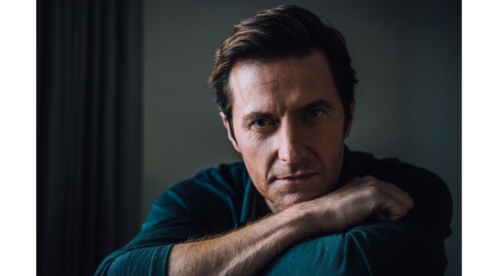
Richard Armitage, photographed by Reto Sterchi for Anthem Magazine, Oct 2016
First of all, let’s have a quick recap of what we see. Richard Armitage. *le sigh*
Ok, just kidding. It is the gaze of the sitter right at the lens – and by extension at “us” – that initially draws us into the image. From this starting point, we begin to interpret the pose of the sitter, as it dominates the image. Leaving the forearm porn aside for the moment, Armitage is pictured in a classic, extremely appealing pose. Resting his chin lightly on his exposed forearm makes for a restful, calming impression. And with the gaze directed at the lens, we perceive this position as Armitage focussing his attention on whoever is sitting vis-a-vis. This impression is intensified by the slightly leaning head and the strong, alert gaze. The sitter has not switched off and glazed over, despite the relaxed pose; he is awake and right there, in that particular moment, as if he is listening to what the imaginary person opposite might be saying, or studying his imaginary partner’s face. If I look at this image long enough, I can almost see his shoulders softly move up and down with every breath, his nostrils flare, and imagine his eyes switching back and forth while he is staring at the face of whoever sits opposite him. We have been in such situations before – regrettably not with Armitage himself – and thus are very familiar with how it looks and feels to be sitting closely opposite someone, staring at each other. I think it is this familiarity with a true-to-life pose, that makes this image so successful.
It obviously helps that we are also shown a little bit of skin, covered in light hair. Even in a two-dimensional medium such as photography, texture is an important visual element. We may not be able to “touch and feel” the contents of a picture, but we can connect what we see, with our mental library of “what this feels like”, and enhance our experience of looking at an image that way. The lines on the skin, the discernible wrist bone, the tendons in the hand are emphasised by the light. Did you catch yourself following those lines with your fingertip on the screen? Don’t worry, it’s a natural reaction, and even if not intended, it certainly means that the photographer created something that not only appeals to your sense of aesthetics, but that it also evokes curiosity and the temptation to touch. It makes a two-dimensional piece of art become three-dimensional in your imagination, tempting you to touch even though the sensation is only in your head, not in your fingertips.
There aren’t that many pictures that instantly get my approval – and it is usually images that have very little background and are shot in studio that receive my praise. Location shoots often result in distracting backgrounds; and since I am a no-frills person, I prefer unfussy, simple set ups. Just like in this picture, which was obviously shot on location, after the AOL Build Q&A, I presume, just based on what RA is wearing here. That implies that the photographer did not have the usual shebang at his disposal, but that he had to work with what he was given. A little bit like photographer Lefteris Pitarakis in London when he shot Armitage during TC run. And photographer Reto Sterchi really uses the set-up to his advantage – which is something that I admire greatly. Improvising, making do – and arriving at an image that pleases and excites the viewer, that is quite a feat. Let’s have a look why this image does exactly that.
Without delving into the technicalities of photography, what stands out to me first of all, is the pleasing colour matching in this image. The petrol blue of Armitage’s shirt is matched with the greyish blue of the curtains. The white walls take on a blueish hue – because they are not illuminated directly – which again matches with the predominant colour in the frame, giving the whole image an organic, whole look. This is – presumably – pure coincidence. For all intents and purposes, the curtains on the premises could’ve been bright orange. But Sterchi notices the complimenting colours and incorporates the curtains into his image.
He serves another purpose with that: He frames his image in such a way that the surrounding environment enhances the portrait of his sitter. Including the curtains in the frame adds to the overall composition of the image by not only breaking up the background, but by providing depth to the picture: We can clearly distinguish the background from the foreground, and we even get an impression of distance or depth from the image.
This feeling of depth is further enhanced by the photographer’s use of a shallow depth of field. He has shot this portrait with a large aperture, which makes Armitage’s face and forearm appear in focus, while everything behind him falls off and is blurred. Again, this draws our own gaze to what the photographer thinks is the most important component in the image – the face. And the sexy forearm hairs, of course.
Top marks to Sterchi also for his lighting choices in this image. Admittedly, this is obviously a personal preference of mine. But even though I love the technicality of setting up a studio shoot with different lights, I am usually a no-fuss photographer who prefers to shoot with what is already there, rather than complicate matters by setting up artificial light. And Sterchi does not mess around with on-camera or off-camera flash, but instead knows how to arrange his sitter in order to get a shot that is interestingly lit and illuminates the essential parts of the sitter: He is shooting with available light (I think). He has deliberately placed his sitter at a 180 degree angle to the light source. A window? In any case, the light catches Armitage from the side and properly illuminates only the right hand side of his face. And that is enough – we can see all that we need to see: the eye, the crinkles, the strong vertical line along the angular forehead, the straight line of the nose, the stubble, the surprisingly brown highlights in Armitage’s hair, the strong nasolabial fold. We even see the little scar between Armitage’s eyebrows, a mark which I like to think of as a memorial to Thorin, or to the long and unforgettable time Richard spent working on TH.
This is fantastic thinking on the job – making the set-up work for you. There are lessons to be learnt from how the pros approach an impromptu shoot; even amateurs can take a leaf out of their book. You may have found yourself in exactly that position – you need to take a portrait picture of someone, and you do not have a studio at your disposal. The thing to do, is this: Place your sitter near a natural light source aka a window. Do not place them in front of the window as their face will be in shadow if you photograph them like that. Likewise, do not place yourself between the window and your sitter because then your own shadow will fall across your sitter. Instead, place them at a right angle – to get a shot like Sterchi does (with exactly half the face illuminated) – or make them turn their head slightly towards the light source in order to get more light onto the half that is furthest from the light source. This kind of approach does not only result in interesting shadow play on your subject’s face, enhancing the facial features, but is also the best way of letting your camera do the work without having to deal with technicalities such as light-metering. There’s nothing better than daylight!
So much for the “incidental” parts of this image. Now let’s have a look at the composition of the portrait. From past *ooof*s I know that you really like the whole gaze line thing, let’s have a look at what the gaze does, when we come across an image like this. Studying the way our eyes roam, gives us some interesting insights into why this image works so well.
 Upon seeing this portrait, my gaze first settles on Armitage’s right eye. From there, my eyes go down towards the wrist, then following the line of the hand upwards right to the knuckles. Then my gaze is guided along the forearm towards the cuff of the shirt. From here, I look upwards along the line of the curtains, then towards the brown highlights on Armitage’s hair. Lastly, my gaze moves from the hair back across the forehead to the eye.
This is how *my* gaze works – it is possible yours works differently, but my gaze line experiment certainly explains to me why this image works so well for me: I am being taken the full circle, quite literally: My visual journey through this image starts at the eye – and ends at the eye. It provides closure – and thus a sense of satisfaction.
Maybe you have a “forearm hair kink” and the strong arm porn in this image immediately attracts your attention, and yet, I am pretty certain that the gaze lines will be similar even if your starting point is a different one. And that is because of three elements: 1) We instinctively look at the eyes of any human (or even animal) we come across; that’s our ingrained way of establishing a connection or signalling the desire to make a first connection in order to communicate. 2) Our attention is caught by the brightest parts of an image. That can be a stand-out bright colour, or white. We associate white or bright patches with light = being able to discern/see, whereas dark areas are difficult to make sense of. It’s only logical that our eyes search out the parts of an image where we will be able to actually discern the contents. 3) We cannot resist straight lines; they pull our gaze along, guiding us from one visual component to the next.
These three elements certainly explain the path my gaze takes: As I look at the image, I am not only seeking for the connection with the human sitter by looking at his eyes, I am also attracted by the highlights created on his face, the brightest parts of this image. From there, the lines of nose arm and curtain draw my gaze along, all the way up to the upper edge of the image. Then, my gaze searches for a bright spot again, and the nearest are the brown highlights on the sitter’s hair. Lastly, the strong shadows created by Richard’s characteristically angular forehead leads my gaze right back to where I started, at the eye. Full circle.
Now, I can tell you with certainty that the photographer did not draw a chart before his shoot with Armitage, deciding that this was the exact composition he wanted to achieve in the portrait. He simply sat Armitage down and asked him to pose in various different ways. But it is not incidental that this image works – there are reasons why, and the various elements of the composition coming together is one reason. And more often than not, it is classic rule-of-thirds composition that makes a picture so compelling. It is interesting, that this image comes across as very pleasing to the eyes, even though the rule-of-thirds is not *exactly* obeyed. Have a look at this:
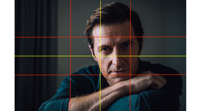
The red lines are the “thirds”, whereas the yellow lines mark a classic symmetrical composition. What I find interesting here, is that Armitage’s right eye is more or less the exact centre of the image, a natural focal point of any picture. The eyebrows almost make it on the upper third line, though, while the other focal point, the sitter’s exposed forearm, takes up the lower middle third. The fact that the sitter is placed off-centre in the composition, tells me that the photographer deliberately composed the image with the background in mind: The curtain in background left balances the sitter in foreground right. Together, all parts of the image combine to create a pleasing, yet interesting composition with strong lines, highlights, lowlights, elements in focus, elements out of focus and diagonals.
If I had to say what I like best about this picture – and “the sitter” not allowed as an answer – I would probably point to the variety of texture – from the fabric of the blue shirt, the hairy arm, the stubble, to the exposed skin. All of this gives the image a “tactile” look, it makes it three-dimensional in a two-dimensional medium. But ok, who am I kidding? If we are talking “feel”, then it is the intimate “feel” of this image – a close-up that allows intense study. There is a certain amount of stillness and calm in this, and even though some might wither under a scrutinising, alert gaze such as this, I imagine it would be quite invigorating to be allowed to just sit and stare. Blink – and you have lost. I’ll keep my eyes wide open.


“Maybe you have a “forearm hair kink” and the strong arm porn in this image immediately attracts your attention”- I do have a kink for RA’s hairy forearms and hands.. ! (Maybe I have an RA kink? Oh dear!)
“Did you catch yourself following those lines with your fingertip on the screen? Don’t worry, it’s a natural reaction” – PHEW! I though I was a complete nutjob for doing this!!!
THANK you- great OOF of an instant classic.
LikeLiked by 1 person
Oh, I regularly stroke my laptop screen. I tell myself, it’s because I am cleaning off little smudges, but surely it’s no coincidence that it only ever happens when there’s a picture of a particular actor showing on the screen…
Instant classic – yes!
LikeLiked by 1 person
Lol, looks like I’m in great company with my screen stroking *cough* and RA forearm kink 😉
LikeLike
Absolutely the best company 🙂
LikeLike
Since we can’t sit down and have a face to face conversation with our lovely man, this image provides the perfect setting to let our imagination fly and wonder about the question we’d ask him. Thank you for your analysis. I agree that the photographer knows his craft. All the blues and the lighting only help to bring out the best of Richard’s masculine beauty to the forefront. It’s beautiful! 🙂
LikeLike
The start of a million fantasies – could’ve been the title of this photo. Now to have a massive monitor which brings the photo life-size up on screen, and the fantasy is even better 😉 Jokes aside – a great picture that makes the most of an incidental set-up. Really nice.
LikeLiked by 1 person
Arm porn, hand porn…. what captured my attention with this picture is the intensity of his gaze.
Suddenly, I feel naked.
LikeLiked by 1 person
“Feeling naked.” YES. You have provided the reaction I’ve been struggling to define all day. Thank you!!!
LikeLiked by 1 person
*coughs* And that is exactly why I did not write the *ooof*let that came to my mind…
LikeLiked by 1 person
Please write it!!!!!!!
LikeLike
LOL – under a break labelled “NSFW” 😂
LikeLiked by 1 person
Whatever the label is I just want to read it pleeease!!!!
LikeLiked by 1 person
Pingback: Those latest beautiful pictures of Richard Armitage | Me + Richard Armitage
Thank you for the link 😀
LikeLike
I love this photo. Best one in a long time.
LikeLike
Agree – even though there has been some nice press photography, this one hits deeper because it feels much more deliberate and intimate. Also, because it is posed – and not in front of an advertising screen.
LikeLike
Very interesting lecture on photography, thank you!
I love this photo, the colour, the light, the mood, and, naturally, the object, which looks slightly amused and with a certain depth in MY eyes. He radiates intelligence, interest and simply male beauty.
LikeLiked by 1 person
You have put that really well: “radiates intelligence, interest and simply make beauty” – exactly what a portrait should do. It really finds the balance between “thinking man” > the intense gaze and “sexy man” > the exposed forearm.
LikeLike
Loved your analysis of this photo. I did not realize one of the reasons I liked it was the hairy forearm. Unless the forearm is attached to Mr. Armitage, I find that body part largely uninteresting. But here, it is silkily beautiful. To me, his expression is slightly frowning, and kind of questioning. Something like, “What do you mean you had a little mishap with the car?”
.
LikeLiked by 1 person
And in one concise sentence, you’ve provided the fictional story Guylty usually writes along with these oofs. Thank you, Kathy!
LikeLike
Fanfiction time. Anybody? Anybody?
LikeLike
I loved Guylty’s oofs too. Glad you liked my sentence. 🙂
LikeLike
I like forearms in general – especially when covered in hair that is not too dark. So this one really hit the mark. I am also thinking – if the forearm had not been exposed, I don’t think the image would have worked so well. Not just on me with my kink, but in general.
And LOL – there’s the beginning of the less risqué *ooof*let…
LikeLike
Well, it is you he is looking at (in my imaginary ficlet). For some reason, I associate you with a car breaking down. 🙂 He knows about your forearm fixation, and has positioned himself so he can hold your attention while explaining how much your insurance rates are going to climb.
LikeLike
Now, I wonder why broken cars are associated with me… LOL. I have no objection to that scenario, although I am not sure whether RA makes a believable insurance broker 😉
LikeLike
Woooof!!! Richie is wearing my favourite colour in this fantastic photograph!! Is there anything to add??? Aww, of course! Great description of a wonderful picture of an outstanding male beaut! To be able to shot this “calm” picture of Richard, inbetween all the media frenzy on that day is especially remarkable.
Thanks Guylty for fighting your weak flesh and spoiling us with this special pressie !!! 😉 😀
LikeLike
Very good point, Linda – getting an image of calm out of a frenzied day, is a feat, too. It does help that the sitter is an actor and a pro. I also get the impression that RA is much more confident when posing for pictures these days…
And oh, the hardship, creating this *ooof*. Not 😉
LikeLike
I found your analysis very interesting and informative. I really like this photo; I love the colours in his top and hair (AUburn highlights) and the tone of his skin; he looks less pale than usual and more tanned IMO. I thought his top was more of a blue grey petrol colour rather than the greeny teal shown in the picture. I know very little about photography but I wonder if the photographer may have applied a tint to get that gold wash to the light?
LikeLike
I wonder, too, because I saw him live that day, and, as we all know, this man is not Palm Beach sun-tanned. He’s an English rose, pale-skinned whitey. (I mean that as a neutral description, not a “racist” statement, relax, everyone.) And you’re also correct, Zigzag, that his clothes weren’t these colors. Though in real life his clothes didn’t look the colors I saw in the Getty’s professionally shot photos of that event either. I stared at his legs for an hour—and I mean reeeeeally stared—and I swear, I didn’t know his pants were striped until I saw press photos later that day. I thought they were solid grey and perfectly matched the grey shoes. But apparently not. How does that happen? (Lighting? Cameras? Perception warped by brain short-circuiting when in presence of The Chosen One?) Not that I’m complaining, mind, because I LOVE THE PHOTOS FROM THIS SHOOT. I think they are absolutely gorgeous, and I squeal out loud (to myself and my computer screen) every time I see one of them. (Which begs the question, do I need images of the man to prove to myself my experience of the real man? Oh my gosh, the implications of that notion…. Too many questions! Too much anxiety! Off to the DVD player for some North & South therapy….)
LikeLike
Interesting observation re. the stripes in his trousers. I did not notice them anywhere. Difficult to say why that is – I don’t think it’s the light as such, but more about contrast and focus. Unless you had been standing right beside the man, you probably would not have seen the stripes. And maybe the photographer played with the contrast settings…
I like the other two images, too, but not as much as this one. The other two remind me too much of some shots that “official court photographer” Dunn has taken…
Did the N&S therapy work? I haven’t seen that in ages… Netflix keeps advertising it to me. I should really look into it again…
LikeLike
Die “North & South” – Therapie hilft immer (und bei fast allem) und ist sehr zu empfehlen. 😉
LikeLike
Schon selbst ausprobiert? 😉
LikeLike
Aber sicher doch!
LikeLiked by 1 person
North & South therapy always works. A viewing of N&S fixes all life’s problems. 🙂
LikeLiked by 2 people
Sounds a bit like a cup of tea…
LikeLike
That’s a really interesting question, Zigzag, and one that I did not really take into account when I was studying the image. (I was probably too distracted by the gaze than to wonder about a tint.) But you are right, the colours are not quite authentic (compared to the other evidence of RA’s jumper, for instance.) Creating that gold tint on a picture is not that difficult and you don’t even need Photoshop for it. Theoretically it is possible that the photographer shot this picture with a different white balance setting than he should have. I.e. instead of balancing the whites based on daylight, he may have shot it with the white balance set on tungsten light or another type of light.
LikeLike
out of all the pictures I have seen of Mr. Richard Armitage, this one is the BEST one. I love everything about it. Mr. Richard Armitage looks relaxed/refreshed not tired at all, but what I really love about the picture is that Mr. Richard Armitage is showing off a very sexy, rugged, manly, look. I know I said I loved everything about this picture but there is one thing that bothers me (even though it looks like Mr. Richard Armitage has no gel,mousse in his hair, which is great) I just wish that before the photographer took the photo, that somebody would of gone behind Mr. Richard Armitage and messed up his hair a little bit.
LikeLike
hehehe, nice idea, Angel – a bit of “bed head” would’ve given the image a completely different feel… Mind you, I quite like the luxurious wave of the hair, and particularly the auburn highlights.
LikeLike
Great analysis, Guylty! I instantly fell in love with this one too! Mesmerizing. It’s right up there with my fave Richard shots evah!
LikeLike
Mesmerising! That’s exactly the word for the gaze. You could really sit and stare for hours…
LikeLiked by 1 person
I must say Mr.STAREmitage is always winnig that “stare competision” cuz I have less and less time IRL…in fact I’m sitting ( luckily for him!!😜all my strategic areas are well hidden under the table) in the same pose as he sits on that photo . Oh well! He’s won again! Thanks for the “ooof” ,Guylty😊
PS: I’m missing your ficklets ,too.
LikeLike
Well, he has the advantage of being caught in that picture while we live and breathe. But then again, he is *always* without competition.
LikeLike
Oh, and PS re ficlets. I should give it a try. I wasn’t sure whether I still had it in me – or whether there was any demand.
LikeLike
Yes, there’s demand, yes!
LikeLike
hehe, noted.
LikeLike
Demand… , definetly!
LikeLiked by 1 person
This was an instant winner for me. I love the dramatic lighting that shows one side of the face and leaves the other in shadow. Also the colors. Together it makes for a portrait that is relaxed, yet able to energize the viewer.
LikeLike
That’s a great summary, Linnet! Relaxed yet energising. It had that effect on me, too. Even in terms of reviving my own portrait photography business. My fingers are itching to recreate this photo with someone.
LikeLiked by 1 person
Ooooh, thankyou for this *ooof* Guylty! I LOVE this photo! Between the gorgeous subject and a good photographer we didn’t stand a chance. 😉 I really hope there’s a full Reto Sterchi photoshoot in future.
LikeLike
I’ve already been scouring Reto Sterchi’s website, but so far only the pictures we already know are on there… Let’s hope we’ll get more!
LikeLike
Great Ooof! I love it when you show us how our eyes move 😀
Now don’t all shout at me, but while I LOVE the direct gaze, and the furry forearm is divine, I dont like the colouring – as has already been pointed out, we know he isn’t tanned at the moment and I just love him pale 😉 The extraordinary definition showing up every little crease and wrinkle makes him look older than he is, imho. I’ll get my coat 🙄
LikeLike
I think you are right – when it comes to the “tan”, that doesn’t look quite authentic. And yes, every line and crease… although personally, I like it when RA looks the way he looks. Makes him a little bit less show-biz god, and more a real person 😉
LikeLiked by 1 person
Herzlichen Dank für deine Mühe. Das Foto ist schlicht bezaubernd und deine Erläuterungen sind sehr erhellend. 🙂
Ehrlicherweise muss ich sagen, dass mein Blick für lange Zeit überhaupt nicht wanderte (Unterarmen stehe ich recht neutral gegenüber). Ich habe einfach nur in seine Augen gestarrt. Der Blick ist faszinierend… der Mann ist einfach schön.
LikeLike
Dein letzter Satz: JA. Irgendwie kann man sich da nicht der Faszination entziehen. Ok, und möchte es auch gar nicht…
LikeLiked by 1 person
Das einzig Positive, was ich über dieses Bild sagen kann: Es ist nicht so katastrophal mies wie die beiden anderen.
Brr. 😦
LikeLike
Autsch. Alles klar!
LikeLike
The intensity of that gaze! There is no varnish on this picture. All the flaws are there in stark reality for all to see, and yet I am drawn to the private man observing from the shadows.
LikeLike
No ooflet in the offing, but here is an ode. Kind of an afterthought, but enjoy.
Ode to a Pretty Face
It’s surely no joke,
We all like this bloke.
With his icy blue stare,
And soft forearm hair.
But gentle as a lamb,
Or sweeter than jam.
It’s tough to love a man,
Much prettier than I am.
Kathy Jones
LikeLike
LOLOLOL
LikeLike
Pingback: Spy Thriller Thursday: Teaser Trailer for Berlin Station Episode 3 involves Richard Armitage’s …., October 27, 2016 Gratiana Lovelace (Post#990) | Something About Love (A)
I’m late responding, but wow what a gorgeous pic’. I can’t tell you how much I love this ‘real’ image, air brushing be damned I much prefer this authenticity! xx
LikeLike
I like reality more than fiction, too, with all its flaws and warts and all. Because it is real. Thanks for reading!
LikeLike
This is so real…I haven’t even been able to respond. I try the gaze line experiment, but I can hardly pull away from the eyes. Maybe a glance along the arm, but right back to the eyes again. Wow.
LikeLike
Hehe, you are forgiven for being held in check by the eyes. It’s hard to look away from them, I agree.
LikeLike
Yes, shamefully this is about how behind i really am.. or i could dress it up and say that i’ve been stuck on these photos ever since! I love this one, of any recent – ie last 2 years this is by far my favourite, for the very same reasons you describe. I too love taking that journey from eye to hand to elbow via curtain to hair and forehead back to eye and so on. I’ve been on that loop many times and will revisit many times again 🙂
I love that he doesn’t seem to wear any make up, that the hair looks silky and springy enough to touch or run your fingers through it, that i could imagine myself following that line on his foreheard and him closing his eyes for a few seconds 😉 I have to imagine him closing his eyes otherwise i wouldn’t dare touch his forehead or his forearm! Who would want to tickle those silky hairs and retrace those bones in his hands. Don’t think we’ve ever had any photo of his quite as tactile. And i admire him for being able to engage the camera like this, sometimes i find his eyes in photos almost too intense, his look is often near to piercing, this is just on the softer side and all the more inviting. We rarely see him sitting still, there is always some kind of energy around him, here he seems to be all calm . I am sure the impression is to do with the deep blue of his shirt as well , but i am so pleased with the effect. It makes me almost hear the crackling fire in the background from a fireplace 🙂 I am so grateful this photo exists! And thanks for recognising its many virtues in such a nice way 🙂 A keeper! Wish this was his profile picture 🙂
LikeLike
Pingback: Good-Bye, 2016 | Guylty Pleasure