Quick change of plan. I actually wanted to go hunting/gathering for materials to decorate the advent wreath with, but now needs must. Jay Brooks has released a previously unseen image from his series of images for the Crucible posters. I can only say *ooof*:
//platform.instagram.com/en_US/embeds.js
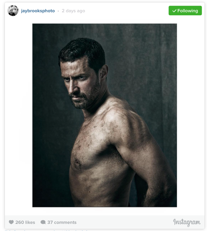
Unfortunately we do not get this image in the same high resolution as the official promo images from TC. This time we see Richard Armitage as John Proctor at a 180° angle to the camera, his body turned towards our right. This is an almost-half length shot of the man which stops just underneath his ribcage. While the torso is at a right angle to the camera, the head has been tilted down slightly and turned towards the camera. That way we get a three-quarter profile of Proctor’s face. The sitter holds his arms loosely behind his back, allowing us a glimpse of his back, too. The image does not provide any context for the sitter or the character depicted – he is simply shot in front of a grey, mottled backdrop.
Much of the general parameters of the set-up has already been discussed in an emergency *ooof* which I wrote in June 2014. Back then, the Old Vic released a number of poster designs to promote their upcoming play The Crucible. Just to recap then: The lighting choice here is quite interesting as it consists of harsh light from one side which creates strong contrast and shadow. Lit from above left, the strong light allows the contours of the body stand in every detail. This does not only give us the pleasure of discerning every single hair on this beautiful body and face, but the lighting also adds a gritty, harsh and aggressive feel to the image – a first layer of meaning added just through the lighting choice.
I always find it really interesting when we get to see several images from the same shoot, especially when some of them are “outtakes”, i.e. images that did not make it to final edit and are therefore not post-produced to the same standard or goal. By comparing them, you can make some deductions on the shoot. Compare, for instance, the backdrop of the official poster and the new image. Both images must have been shot against the same grey, mottled backdrop. But the Crucible poster has been given an extra texture that looks like a flaking wall. – Also, the comparison here confirms for me that our assumption that the poster image had been flipped, is correct – set up and background of the two images are identical; it is unlikely that the photographer swapped set-ups.


The pose here is slightly different from what we saw before. Instead of a prominent shoulder monopolising our gaze, we get to see more: While the pose is somewhat forced, with the sitter holding his arms loosely behind his back, it allows us an unrestricted view of his side, and we can see the contour of the sitter’s back. The pose reminds me of a dancer, with beautiful, commanding tension in his body, much like a proud Flamenco dancer: back stretched, shoulders pushed back, arms tensed. The athleticism of the sitter is also emphasised by the glimpse of his ribs. Not an ounce too much on this man… or his he holding is stomach in? I have vague recollections of some softness around Proctor’s mid-riff from the shirtless scene of the play that this image is presumably referencing.
Where I found the earlier image slightly counterproductive (in that the soft rounded shape of the shoulder is often associated with female subjects, emphasising the female form and associating fragility and sexiness), this one ticks all the right boxes: The pulled back arms make the shoulders look impressively strong. The tensed arms cause the biceps to bulge slightly – there is power and strength in this pose, less fragility. In that sense, this image literally embodies the character from the play very effectively: a strong man, both mentally and physically, who is used to physical labour, and who considers himself (even if not consciously) a sensual, sexual animal. There is a visceral quality to this image, it plays very directly with strong sexual markers – the biceps, the visible body hair (chest, armpit, forearm, beard), the nose (?) – and clearly appeals to our inner cavewoman. *rrrrrrrr*
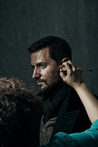
The most coveted job in the world… mvtbeauty works on Armitage. Photo: mvtbeauty
As such, the image very much meets my approval *just* as a woman. However, in terms of its function, i.e. a promotional image that promotes a specific play through the photographic characterisation of its protagonist, it does not work as well. The sensuality and sexuality conveyed in the image is too overpowering to give enough room to the moralistic dimensions of John Proctor. His sensuality is only just *one* facet of the man; in the play, it is his mental strength and his unfailing morality – despite sins of the past – which make him the hero of the piece. While the image does not exactly represent gratuitous nudity – there is, after all, a scene in the play where Proctor briefly appears bare-chested when he washes himself after coming home from a day of working as a farmer – I nonetheless do not really see a meaningful representation of a real-life situation in this pose. The dirty, naked body in this pose reminds me more of a miner, taking a pause while working underground in 40°C heat, than a farmer who has spent his day doing whatever farmers do. That is not an accusation levelled at the enviable make-up artist, btw. She has done a great job, creating body make-up that enhances the body contours and thus the physicality of the man. Look, for instance, at his shoulder and note how the two dark lines of make-up add a strong three-dimensional feel to the muscles, almost as if there are grooves in the shoulder. (You can see mvtbeauty here in an image that shows her touching up the make-up on the shoot – the image must have passed me by back then, hence I am including it now.)
Maybe the sensuality could have been dampened down a bit by a closer crop? For the fun of it, I tried it:
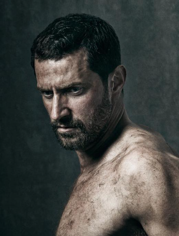
Crappy crop of John Proctor, original by Jay Brooks
The crop here shows that this pose does not really work as well as the shoulder shot of the final version. While Proctor’s gaze is equally intense and suitable, the shape of the torso visible in the crop does not add as much interest to the composition, as the lines of the shoulder in the final version do. In fact, the expanse of skin is almost a bit nondescript, despite the applied dirt/make-up, and part of the body ends up “cut-off”.
In conclusion, knowing the play and despite reacting quite strongly to this image *coughs* ’nuff said, I can actually only agree with the decision *not* to make this one of the official posters. My first reaction to the new image was “I’m too sexy for a Proctor”… Right, said Guylty. There’s nothing wrong with sexy, and personally I like sexy *coughs*, but this is very much Proctor animalis as opposed to Proctor moralis. Less skin is certainly more, in terms of a Proctor portrait. Besides, having this plastered all over London’s bus stops and tube stations, might have caused chaos and spontaneous female breakdowns. Thank you, Jay Brooks, for sparing us that. At least back then. *thud*


Reblogged this on One Last time? Never.
LikeLike
Thanks for the reblog!
LikeLike
You’re right: he looks like a coalminer. It was my first thought when I saw the announcement of TC and the first image of JP: ooops, didn’t get it, that Millers Play took place in a coalminers society 😏
LikeLiked by 1 person
Yeah, I am wondering what Proctor is doing out there in his Massachusetts fields that makes him so dirty… Maybe he is laying some sort of drainage…
LikeLike
This is sheer porn. Had they released this as part of the ads for the Play, there would have been massive car wrecks and people walking into each – distRActed, one should say.
But nonetheless, it is porn. Pure. D. Porn.
,
,
,
,
,
,
,
,
porn is good. *nodnod*
LikeLiked by 2 people
Yeah. I am not really complaining. It’s a very attractive image.
LikeLiked by 1 person
Well it certainly has ME going!!!!
LikeLike
Right On 😈
LikeLike
Fascinated by the technical details.
He looks to me as if he’s been wrastlin’ a steer in a very muddy field.
LikeLike
Oh, that is an interesting interpretation. I like it.
LikeLike
I’m impressed by your detailed description and your thought – you must have stared rather long at him, haven’t you? For scientific purposes, of course! Only scientific … I like”overpowering sensuality”, by the way XD
And thanks to your last comment about this picture being plastered all over London, I have this image in my mind of police officers returning to the station, carrying bundles with accident reports, and on every single one, the point “cause of accident” says either “distRAction” or “Proctor animalis”. And the clerks just go: “Again?!” XD
LikeLiked by 2 people
*coughs* yeah, someone has to do it, I guess. The hardship is killing me.
And that would’ve been a nice storyline for an accompanying *ooof*let. These days my mind just doesn’t seem to be able for fiction…
LikeLiked by 1 person
“the soft rounded shape of the shoulder is often associated with female subjects, emphasising the female form and associating fragility” – in my mind the bare shoulder poster chosen for The Crucible poster works extremely well — it depicts Proctor at the end of the play where he is more exposed, broken…’naked’ and vulnerable. Like you say, Proctor is more fragile in body and mind by the end of his ordeal. For me the clothed posters convey the sexy, manly and in control Proctor from the beginning of the play.This why I think this photographer really captured John Proctor and not Richard Armitage (except in Richard Armitage capturing John Proctor). I really felt something from this photographers photos of the character. I absolutely loved The Crucible posters. Which made me disappointed in the Love Love Love poster – I guess I was spoiled by the calibre of The Crucible posters.
LikeLiked by 2 people
Yeah, I don’t necessarily disagree with you on the use of the exposed shoulder for the poster. It does add a particular interpretation to the play (or to Proctor), and it is true – the invincible bull of the first act has *almost* been broken at the end of the play. Personally, I think the message of the play is still that his spirit is unbroken. That’s why he chooses death.
Brooks really did a fine job with his images. I particularly liked that they were so dark (in terms of background, clothing) – which then emphasised Proctor’s intense gaze or his exposed skin even more. They are excellent portraits of Proctor, the man, and I am not surprised that so many fans have framed them and display them on their walls.
As for the LLL posters – they appeal to me because contrasting colours always work for me. But I agree that the poster is not really very expressive in terms of the actual theme of the play.
LikeLiked by 1 person
I really enjoyed what you wrote about this picture/poster. when I first seen that poster(on me and Richard’s blog) it made me laugh just a little bit because when I looked at it, it looks like Mr. Richard Armitage is peacocking. he has his arms and shoulders pulled backed and chest puffed/ stick out and he has( to me) a cocky look on his face. the picture that has him looking over his right shoulder is great (not peacocking in this one) slouching a little bit, shoulders down and chest is not puffed out, and his face has some anger with a touch of sadness in the eyes.
LikeLike
Peacocking – that’s a great term, and I think it is quite descriptive of what I described as a Flamenco dancer’s pose.
For the purpose of the play, I find the other picture better, too. The whole vulnerability thing is so much more present in that. This one is more assertive, has a touch of invincibility that does not quite sit right with Proctor, I suppose…
LikeLike
This pose also seemed “not ready for The Crucible promo” to me–as if the photographer had caught Richard Armitage in a quick stretch before he assumed the “intended” pose. But still … Sighhh! Thanks for sharing your take on the image–always interesting!
LikeLike
There’s a thought – maybe it wasn’t posed, but it was a split second movement. Who knows – but it does look good, regardless 😉
LikeLiked by 1 person
Indeed! Sighhhh!
LikeLiked by 1 person
*sobs* can’t see the first picture…….it’s just a big blank box :o(
Same with someone’s stage door vid you posted the other day. Don’t know what’s wrong, I’ve always bee able to view pics here.
Nice ‘ooof’ all the same, thanks xx.
LikeLike
same happens to me, click on the square towards the bottom where the writing is and it should take you to the instagram post which shows it 🙂
LikeLike
Thanks xx
LikeLike
Is this the link you can’t get to work?
LikeLike
How bizarre – the Instagram embed works in the comments but not in the body of the post. Grah!
LikeLiked by 1 person
Your original post if it worked for me, but I didn’t know if my copy of the link would work in the comments or for anyone else.
I think the variety of formats (if that is the right word) we all use work differently on the different devices we use as well. Not that I am an expert or anything, which is why I tried reposting the link to see if it would work. 🌻
LikeLike
Thanks Mimi, I can see it now xx.
LikeLiked by 2 people
🌻
LikeLike
Damn, I suspected that. I have tried to embed the original Instagram post from Brooks here, but somehow the embed feature doesn’t seem to work with my blog. It’s not the first time this has happened. I’ll try and work around it.
LikeLike
The pic is there now Guylty, thanks. It really is the sort of pic you need to see BIG ;o)
LikeLike
Exactly. The official posters were great for that…
LikeLike
Again, your link works, but the image doesn’t show. I’ve copied the link to try it but don’t know it it will. 🌻
LikeLike
It looks as if the white box opens up to the instagram link, but you don’t see the image. Sorry
LikeLike
I have just done a work-around. Thanks for trying, Mimi – not sure what is wrong with my blog. It always does this…
LikeLiked by 1 person
Wow, we are completely spoiled this year end, so many new photos, a play, a series and this special gift. I never expected such a great flash back to the Crucible at this stage.. it makes me want to see it again which i just might 🙂
Do you know what my first thought was? Boy, the man can act!!! And it is all credit to him! Not that the physicality of it is not impressive, i’m just talking from first glimpse (i’m totally weak where his looks are concerned but there is just something else there). With stage door pics and videos aplenty, with images and recounts of Kenneth and BS at the same time this is so strong, so very very different, from the man, from his other roles. With his natural presence so understated and BS being such a different kind of thing and more ambivalent this is a sudden and very stark reminder of how raw and intense his can be. He’s an extraordinary chameleon, is he not? This unpredictability and capacity to transform so profoundly with just the glimpse of an image is so exciting! 🙂 (or maybe i am just terribly biased towards Proctor 😉 but truly, however spectacular his body really is i am inevitably drawn to his face and the complexity and intensity in it).
It wouldn’t have occurred to me to compare the 2 images but you are so right in pointing this out! I can’ stop giggling at the thought of this imagine displayed all over London. Goodness me, it would have bee shocking and disturbing to say the least! But people would have expected more something like Spartacus than Miller.. but then again, here’s a thought .. is Proctor in a way not like some gladiator in the pit surrounded by the blood thirsty crowd? But i agree with you i’s a picture of strength, especially and predominantly physical one. And that’s not the best of Proctor or the most interesting side, the moral strength he finds in weakness is more representative. Funny how seeing the two images side by side emphasises that, in the poster one it’s almost as if he is looking away, shunning the light, i think his head is even slightly more tilted, bowed and the look in his eyes more introspective.
Strange, i shunned that poster and never bought it. Beginner’s fears… ‘can’t have naked shoulders of the man around’ 😉 I so wish i had now because i understand much better how he uses it and what an integral part of his acting it really is 🙂 And beautiful as well.
The make up job is amazing and yes i’m smiling here at the thought of how long it must have taken to brush all that grime on.. everywhere 😉 Indeed more miner than farmer, but then again it maybe emphasizes his connection to the earth, what grounds him and makes him. It doesn’t feel wrong on him to look like that, somehow it’s not dirt but some strange expression of a communion his has with his land. Can’t explain it, it just feels like that.
How wonderful the Crucible still keeps on giving 🙂 And thanks go go Jay Brooks for capturing so much of the Crucible and Proctor in a few brilliant images. (makes you wonder how much of our memories are actually defined, influenced by the posters).
Thanks for taking the time for the very insightful analysis!
LikeLiked by 3 people
There is a post in its own right here, Hari! Yes, he is a wonderful actor – it always amazes me how different he is when we see him “off work” at the SD or at events, he is just so different. He inhabits all these characters so completely – and Proctor was one of his finest creations. It just completely shows that he lives within the characters, he has researched them, has made their thoughts his own, and his face, his movements become the character’s. It shows in the photos, too. He doesn’t just point his face in the direction of the camera – he *acts* the character in front of the camera. Consummate professional, of course. IT also speaks of an acute self-awareness, I think, a consciousness that he *knows* he looks different when he is himself.
“The moral strength in weakness” – that is a really interesting observation, and very fitting for Proctor. Maybe that is why the other picture is more descriptive of Proctor than this one? He is an incredibly complex character, and I am not surprised that RA said he was a dream role for him, and a role that occupied his mind so completely for months and months.
I also like your interpretation of the make-up dirt – the connection to the soil, quite literally, in that it covers him and marks him. “communion with the land” indeed. One could also say that the dirt stands for the “earthiness” of the man, his direct and uninhibited speech, the sensuality of the man, the man as a sexual being.
Wow, there is a lot more in this picture than I thought…
LikeLiked by 4 people
It is all beyond my grasp too, but helpful when people let you know what they can’t see so you can try to fix if possible 😈
LikeLike
Exactly – really important because otherwise the whole post is hard to understand. Thanks xxx
LikeLiked by 1 person
Danke – wer hätte gedacht, dass ich von Bildern, die einen dreckigen Mann (im wahrsten Sinne des Wortes und ganz ohne bösen Hintergedanken) zeigen, so fasziniert sein könnte. Sowas von fasziniert… ❤
LikeLike
Agreed, lovely image and so glad they released it. But not for the poster.
LikeLike
It took a long time… but better late than never…
LikeLiked by 1 person
The chest fluff… sigh…. 😉
Love your Proctor animalis as opposed to Proctor moralis analysis, feels spot on to me!
LikeLike
I admit, I have taken my cue from Armitage himself, who pointed out that Proctor was clearly a “sexual being”. That rang very true to me – sure, Proctor has the moral high ground in the play, at least when it comes to the alleged witch craft. But he is not a cerebral man; he is very much an instinctual man…
LikeLiked by 1 person
Yes, I remember him saying that. 🙂
LikeLiked by 1 person