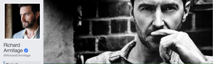
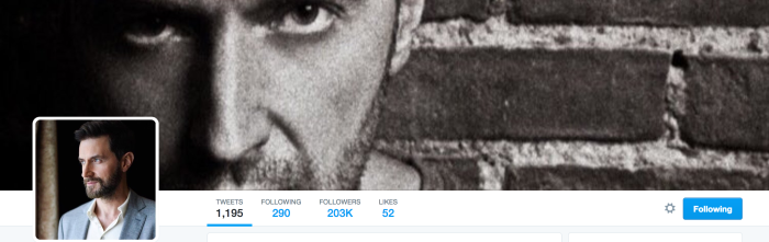
It has taken me a few days and a reminder from RAnet to finally get down to commenting on Richard’s penchant for up-to-date updating of his social media profiles. No sooner was LLL over and BS finished airing, and the man was on a plane, had written a massive Christmas message, and deleted all traces of BS from his Twitter and Facebook headers. I noticed it immediately – especially because they are such unusual choices of image: First of all, both photos are (relatively) old, taken by photographer Paula Parrish in 2012 for a shoot in Fault Magazine. Secondly, Richard looks much different in those photographs – chunkier, shorter hair, and sports rather assertive gazes. Thirdly, they have a very specific aesthetic – which was not appreciated by all of the fandom at the time.
I find it very interesting that Richard chose *these* images as his header illustrations – every fact another piece of the puzzle. Or just a reason to wonder: Assuming that one only puts up images of oneself, that one likes, is this his preferred look, short hair, chunky-muscular presence and challenging gaze? And is this the kind of aesthetic he (also) likes – not polished, but deliberately fuzzy, smudged – very edgy? Or was it just the first imagery he came across when he was looking for something to fill his header with? (Or – left-field interpretation: Was it his Twitter/FB slave, who had been given the order to change the profile and put something new up?)
In any case, since the header changes did not go unnoticed, yet some fans were asking whose pictures these were, I thought I’d re-post my existing analyses, aka *ooof*s, on some of photographer Paula Parrish’s images of RA. The FB header image is actually among my *ooof*s, just in case anyone is interested. All three analyses were first posted on me+r in January and February 2013. I am including them unedited and in their entirety, in chronological order. So this is going to be long. To avoid clogging up tumblr and the WP Reader, I am putting them under the break. Get yourself a cup of tea and sit comfortably. You have been warned. Enjoy.
*ooof*: Alienated Richard
As a little nod to our hostess I am picking up on a suggestion of hers for today’s instalment of *ooof*. She suggested a look at the most recent photo shoot of Richard’s – the FAULT magazine fashion spread, shot by Paula Parrish in New York. This is an as-yet unpublished spread, and all we have seen so far are a couple of previews that FAULT themselves are teasing us with, plus the caps and behind-the-scenes video of the shoot itself. I have chosen the image that is also going to appear as the alternative cover for FAULT 13, due to come out in two weeks’ time. There is another reason why I am following Servetus’ suggestion. After my last *ooof* which concentrated on the photo shoot of Richard by Victoria Will, this will provide quite a contrast to the images that I hailed so enthusiastically last time. In fact, the differences – both photographically and in terms of approach – could not be greater between these two female photographers. Let’s look at the image itself first.

Thinking hard?
Richard Armitage in a fashion image by Paula Parrish from forthcoming FAULT magazine, issue 13.
Image sourced on richardarmitagenet.com
Armitage is thoughtful. Reminiscent of Rodin’s thinker, Armitage is posing outdoors, head (almost) in hand, staring off-camera. He is sitting at an angle to the camera, leaning against a wall in what is obviously an outdoor space. His head is at an angle, with his right hand reaching up to the crown of his head to give us the pensive pose. Parrish has chosen a nice pose for her subject – the half-profile of Armitage’s head accentuates Armitage’s prominent nose – a trademark of our man??? – while bringing his left eye (almost) into the centre of the image. For the droolers among the viewers, there is also the exposed neck which stands out clearly against the background and which is crying out loud to be stroked and touched, while the right hand with a slender-looking wrist invites the viewer to gently grab and clasp in an effort to move Armitage’s head closer for a little snog. (Oooops, has my imagination run away with me again???)
Has Armitage just come back from mucking out the stables? Or has he been on a two-month mission in Afghanistan again? His skin appears dirty, with streaks of mud on his wrist and forehead, stains on his jumper and a solid stubble on his cheeks. Rhetorical question – you and I know from watching the FAULT video again and again and again that Armitage had scrubbed up pretty well, was squeaky clean and in fact quite nicely, even if casually, dressed for this shoot. The stains and dark patches we see on the images are caused by a very special type of post-production that is more or less a trademark of Parish’s: This image has effectively been photographed twice. Parrish has firstly done her primary shoot with Armitage. At a later stage she has re-photographed the photograph to achieve this visual effect. If you are interested, hop over to her portfolio page where you can see how she does it: She projects the image onto a rough, uneven wall and then photographs the projected image again. And there is her final image.
This leads to an interesting effect. While, on a superficial level, the viewer might get misled into believing that the sitter is dirty and just home from a Rugby match, in fact she is effectively “de-facing” her subject. The image itself almost becomes a meta-image. As a photograph is only one interpretation of a (person at a) given moment in time, this is now an “interpretation of an interpretation of a (person at a) given moment in time”. (Do you still follow me? I know, I am drifting into structuralist thought again.) As such, it interestingly supports Barthes’ reading of an image as a “punctum” rather than a “studium” – due to the added layer of alienation, the image receives more personally, emotionally touching detail than if viewed in its original version. (Now, that’s all my fancy analysis – it could well be that Parrish does not give a flying f*rt about this and simply likes the visual interest of her photographed projection…)
Whether substantiated with some high-flying, pseudo-academic theory or not – the image *is* interesting to look at. But having said that – this technique is rather unusual for a fashion spread. It is not unusual for a photographer like Parrish to churn out work like this, though. A look at her website will tell you that she is a fashion photographer – but she is also pursuing fine art photography at the same time. In this shoot – and a number of previous fashion spreads – she has married her fine art aesthetics with the commercial brief and created rather distinctive fashion images. It can be argued, that this alienated depiction of clothes (and their wearer) may not be ideal for a fashion spread. After all, the clothes are getting obscured by the grainy, bumpy, dirty textures of the projection surface. The conversion into b/w adds another layer of alienation/divergence onto the intended presentation of clothes… In that respect, I would not necessarily call this a good fashion concept.
In terms of portraiture, however, this is extremely thought-provoking and interesting. Yes, the sitter is getting obscured, too. The viewer now has to penetrate two layers of interpretation instead of one. (Or even possibly more if we consider that the sitter himself is only offering us an interpretation of self as he is consciously posing for a fashion shoot and acting a part as requested by the photographer/client/stylist/himself…) I find this a fascinating challenge. Not only is my eye engaged in discerning details, in telling fact apart from effect, but my brain also needs to interpret fact and effect into a meaning. Moreover, images such as these score less on droolworthiness and more on the aesthetics – giving “the thinking fangirl” a good excuse to ogle “Alienated Richard by P. Parrish”… I mean, seriously, which intellectually equal husband could ever complain if his esteemed other half stuck an artsy-fartsy murk shot of Armitage to the wall…
Hope I haven’t alienated *you* with my theorizing! I have only really scratched the surface of what I wanted to address in this *ooof* – it looks as if I have to do this in two parts. I don’t think I can rely on your patience much longer today. And nor can I on mine😉 – I will finish this up asap but am meanwhile looking forward to what you have to say about this shoot…
[This *ooof* appeared first on January 2, 2013 on me+r. Click HERE for the original discussion and comments on me+r.]
*ooof*: Alienated Richard ii
Last week’s *ooof* on Richard’s cover for Fault Magazine was only the first half of what I have to say on the matter. Veering off into critical theory, I did not have time to discuss some of the practicalities of this shoot by Paula Parrish – and I think that was what Servetus had really thought about when she suggested I analyse this particular shoot. Because the great thing is – we have a little “Behind the Scenes” video of the shoot that I will draw on to give you a little insight into a pro (fashion) shoot. I urge all interested readers to refresh their memory and have a drool look at the video here (the hardship…) For your delectation and the purely aesthetic illustration of this text, I am giving you the other finished Fault shot from the same series that has so far been seen.

Another image of Richard Armitage by Paula Parrish for Fault:
Not quite himself, in Guylty’s opinion.
Source: richardarmitagenet.com
Let’s talk a bit about the reality of a photo shoot. No doubt you have seen fashion photos being produced on shows like America’s Next Top-Model and such like. It looks all very glamorous with fancy locations or brilliant white-walled massive studios, loud music blaring, 15 assistants on stand-by, no expenses spared on props (helicopters hovering in the background, anyone?), models stretching in poses that would send a Romanian gymnast into spasms, and a hyperactive photographer pornographically moaning “yes, baby, yes, hold that look, I liiike it, ahhh, that’s gorgeous!” Well, none of those shenanigans here. We know from the credits that besides Parrish there was also a stylist involved, two fashion assistants and the male equivalent to a make- up artist for the grooming. In keeping with the casual clothing that is being upstaged by Richard, a pared down location has been chosen. This appears to be the courtyard/backyard/enclosed outside space of a bar (The Diamond in Brooklyn, NYC, by the way). A beer garden actually. Not much to look at really, when you see it in the video. Brick walls, faded wood panelling, industrial lighting, some ivy clad walls. But that does not matter much. A pristine location is not really needed as it only serves as a partially seen backdrop. Only bits of it are visible in the finished images, and with her usual aesthetics at the back of her mind, Parrish can neglect that. Her final edits will show the rough texture of her projection surface and thus soften the details. Moreover, she appears to be shooting with a largish aperture, creating a moderately shallow depth of field, maybe an f-stop of about 5.6 or 6.7? This means, only the parts of the intended image she has focussed on will be seen in sharp focus while everything else falls off. Who cares then, what is in the background, especially if the resulting images will also be edited as a monochrome (sepia? b/w?) picture.
Note, however, how she carefully takes the graphically, abstractly represented background into consideration when she frames the shot. This is something that sets the snapshot apart from the intentional shot – or the amateur from the pro: backgrounds play an important part despite being, well, not in the foreground. A busy, overly colourful or confusing backdrop can be distracting. For viewers not used to closely looking at, never mind analysing, an image, this is an effect that is sometimes hard to put a finger on. And yet your brain will register it, and form a dislike to an image. In the example above, Parrish has very cleverly composed the image so that the top of the wooden panelling is exactly horizontal. This is particularly pleasing as this line also happens to lead directly to the subject’s eyes. It is one of those guiding lines in an image that serves to draw the viewer’s attention to the main focus (which most commonly is the eye of the sitter). The strong white line also serves to cut the background in two parts: a “stripy” lower three quarters and a blotchy, different quarter above. This adds visual interest without distracting the viewer. Compositionally, Parrish has also put on a little twist by “pushing” her subject in the right hand half of the image. This kind of composition sort of deviates from the rule. (Logically, we would expect the subject to occupy the centre of an image. That has conventionally always been the case in pre-impressionist painting and early photography. With the growing awareness of visual conventions, this deviation from the convention has become a much-used and yet still effective way of creating added visual interest.) The space on the left, although here picturing “something”, serves as so-called negative space, i.e. unused space in an image that does not contain any information. It both gives the eye a spot to relax on, and with its emptiness also contrasts heavily with the onslaught of beauty information on the right. It therefore serves to divert the attention to the “positive space” on the right. The use of negative space always adds a certain edginess to the image. It screams “I break the rule (of thirds), I am unconventional”, both of which fits nicely with the subject matter (casually dressed man with casually stubbly face who is defying the rules of photography by refusing to smile ;-)) as well as the photographic aesthetic (dirty, gritty b/w with stains and smudges).
I must add here, that many compositional choices can actually be made in post-production. With the cameras that are being used today, photographers take images that have enough pixels to be easily blown up to A0 size (bus shelter ad size, in laymen’s terms, or 70”x42″) despite mimicking the 35mm film format. In order to receive a final image that is big enough to fit on a magazine page (roughly A4 size), the photographer can crop quite a bit before she loses definition, as you can imagine. There is no knowing whether Parrish has cropped much, here. It is also possible that she has straightened the image in post-production in order to receive the horizontal line, easily possible here as the subject is leaning forward and will not look out of place if not pictured sitting straight. (This would be not as easy to achieve if the subject was standing.) In all honesty, it could all be fluke, as much of photography is (see this *ooof*). In the heat of the moment the photographer may not notice all the elements of the shot in the viewfinder’s frame. The more experienced the photographer, the less likely the fluke, though. Mind you, I’d be flustered out of my brains if I had Richard in front of my lens, and I would mindlessly click away without being able to take much in aside that handsome face and hot body.
Parrish, however, does not look flustered in the video. As far as we can make out, she takes her time in setting up the shots and then carefully choosing her angles and framing the shot. The above jokingly mentioned gymnastics frequently do come into photo shoots – but for the photographer rather than the model. Observe how Parrish is balancing on benches and tables, bending down and forward to get to the exact spot from where she wants to take the picture. Much of this is trial and error. She just shoots away, creating as many variations on the one theme as she thinks necessary. She will only see on the computer screen later which of the experimental angles have worked out best. – As visible in the vid, she does prefer an angle that is slightly higher than her sitter’s eyes (hence the gymnastics). Some of that may be incidental as she has perched herself higher than her subject. It might also have to do with the fact that shooting from slightly higher than the subject’s eyes is usually more flattering to the sitter’s face. If looking into the camera, the subject has to move his face upwards – which will stretch unsightly, possible double chins out of sight and accentuate a pleasing chin line. Well, Paula, none of THAT was necessary with Mr Armitage!!! Not a trace of extra chin-material in sight. You can actually photograph Armitage from way below and still catch a chin line that you can cut diamonds on! (cf. kissing scene in N&S)
This *ooof* has positively turned into a medium sized thesis at this stage. Sorry, but one more point to raise and bring this picture analysis back to where I started last week, namely the comparison to Victoria Will’s black-on-black portrait shoot . And that concerns what I would call “capturing the essence” of the sitter. If you remember, I talked in *ooof*: Guylty appr*ooof*s how the images belied that Will had put her subject at ease and thus captured his personality in his varying facial expressions. In my opinion she did that by engaging him in conversation. His facial expressions are lively and varied, from amused to entertained to intent to thoughtful. In that respect, I argued, Will succeeded in representing images of the “real” Richard Armitage. This is not the case here. As is apparent from the video, Parrish does not seem to be conversing with her sitter. She probably will have given him direction on posing, but other than that there does not seem to be banter or conversation. In consequence, the shots of Armitage seem more artificial and consciously acted. This is not “Richard Armitage” but “Richard Armitage modelling”! Some of this could be the effect of Parrish’s style of working – she may prefer to give sparse direction only and otherwise concentrate on the task at hand rather than talk. And it is most probably also caused by the brief, which, I assume, was to create a fashion spread with the emphasis on the clothes (which happen to be modelled by Armitage), not on the sitter – even if the resulting images will also be accompanied by an interview with the actor. (The editing of the video may also have something to do with it, omitting all evidence of photographer and sitter communicating verbally.)
I don’t know if you have noticed it, but hence in this post I have also avoided the word “portrait” and used the words “shot”, “image” and “picture” instead. Because these are not portraits, imho, but fashion shots! I hope you can see how the two shoots differ in their portrayal of Armitage: Victoria Will creating a personal portrait of the actor and Parrish staging him in the role of a model. Neither is better or worse – they serve different purposes and are both splendidly executed. Which one you prefer is very much up to your own aesthetics and preferences. It’s a hard choice, though, when the subject in both is so strikingly gorgeous that he makes your mouth water and your eyes drool. Or the other way ’round.
[This *ooof* appeared first on January 9, 2013 on me+r. Click HERE for the original discussion and comments.]
*ooof*: Monochrome Richard
Let’s talk a bit about b/w photography today. Richard’s previous photographic output does not contain much b/w work. That, of course, is not his decision – the photographers he has been working with, by and large eschewed reproducing him in b/w. With the exception of five portraits for Red Magazine in 2007 and a few b/w’s in the ill-fated (unpublished) Project Magazine, Richard only makes an early b/w debut in a group shoot in spring 2005 for a magazine (photographer??). The absence of b/w portraits, however, is conspicuous and begs the question: WHY? –
B/w, of course, takes us back to the history of photography. Don’t worry, I am not going to go off on that tangent, however much a history nerd I am. Just to say that b/w was initially the only photographic reproduction that the early inventors of the method could achieve. Over time, the (chemical) processes of photography evolved and became accessible to all. And yet, b/w proved to be enduring as it was achieved by a relatively simple process that amateurs could recreate in their understair cupboard darkroom at very little cost. Colour, on the other hand, demanded more and different chemicals and a lengthier process, hence never caught on as popularly. After decades of skepticism, photography eventually got even recognised as a medium of art itself. But *only* in b/w, not in colour. Colour photography did not make it as “art” until the late 1960s (Stephen Shore was one of the forerunners in the US, Paul Graham led colour photography into art galleries in Great Britain). It was predominantly seen as a medium for commercial photography – as in advertising and fashion shots. – Within the realm of portrait photography, b/w has always maintained a high profile, if you pardon the pun. And so it comes as no surprise that a number of b/w versions of Richard’s actors’ headshots are reproduced and accompany his page on his agents’ website. Interestingly, Richard’s colour portraits are also being edited and converted to b/w by thousands of RAfficinados on tumblr and elsewhere – a sign that b/w is still/more than ever? seen as a particularly expressive form of photographic representation of the human face…

What goes on behind your pretty forehead, Richard?
Armitage in a fashion photo by Paula Parrish for Fault Magazine
Sourced via RAcentral
It is, however, curious, that it should be in the context of a fashion shoot that Richard crops up in b/w again. The latest shoot of him for Fault Magazine – already discussed to death by me here and here, and pulled out of the dusty cupboard again upon special request of tumblr RArmy member suddenwaves, – features Richard as the model for a fashion spread, but also accompanies an article about him. In light of what I wrote above, an unusual choice by photographer Paula Parrish – but then again that is her style and she is not unprecedented in shooting fashion in b/w. Those of you who were “conscious” in the 1980s will remember the iconic fashion photography of Peter Lindbergh, Richard Avedon and Bruce Weber, who transformed fashion photography (alongside others) into an altogether stylized and art-conscious medium with their classic photography. A lot of it made it onto many a teenager’s bedroom wall – supermodels galore – along with the rennaissant return to b/w street photographers like Robert Doisneau or Henri Cartier-Bresson.
In some of the previous discussion of the Fault shoot, some readers have expressed the opinion that b/w is not the appropriate medium for a fashion spread. One could argue, that colour is one of the defining characteristics of a garment. But is it so in this shot? We know that Richard is wearing denim trousers – just visible on the bottom left – and a casual breast pocketed, striped shirt. Whether this shirt is grey or light blue or indeed pink – it does not matter so much as the defining characteristics here are the textures and the details of the tailoring – the unusually asymmetric breast pockets, the rough fabric, the casual collar.
It is only logical that this kind of garment is worn by a man who is not the epitome of an upper-class ponce. No Bertie Wooster, please, more of an action man. John Porter comes to mind, and if Thorin were alive in 2013 (eh, or if he were not a fictional character, I guess…), he might be wearing a comfy shirt like this when he is relaxing after a hard day’s pursuing of Smaug. Richard is slowly but surely becoming the synonym for “stubble” – and doesn’t the stubbly beauty complement the shirt perfectly? This is not a shirt for a pretty boy – it’s a shirt for a MAN (and yes, that demands capital letters here). From the chest-emphasising pockets to the roughish texture of the fabric – this is action man attire. Accordingly, and quite fittingly, this kind of man (and attire) has to be set in scene outside. No clinical studio backgrounds or plush curtain drapes – a mere brick wall anchors our model outside and gives context to the clothes.
As does the pose. This is casual wear. This is a casual wearer. Richard is leaning relaxed in a chair. He has his right leg casually crossed over his left knee. He is taking a break. But he is alert. The left index finger across his upper lip is a gesture of thinking and concentration. His gaze confirms the pose – his eyes are fixed onto the camera (maybe sliiiiightly to the left of the camera?), with a hint of a furrowed brow giving us the indication that there are brains behind the handsome exterior. Even with the face slightly obscured, the viewer still can interpret the face and the man: “I am a doer!”, this face says. “I am concentrating, determined. I am serious. I have thoughts going on behind that finger. I am not merely acting a clothes horse here. I am *more* than a pretty exterior.” All of this is conveyed in a pose, a gesture and a look in the eye. And what is more: It is put into the service of advertising the clothes. Because with every fashion image we are sold infinitely more than just a garment: We are sold an image, a life-style and a dream. This particular one sells us the dream that whoever buys/wears these clothes will be an active, intelligent doer, a man that oozes confidence and self-assuredness, who is strong, possesses good taste and style, who has everything going for himself. Who could better sell clothes than actors???
To return back to the initial question – why does Richard not get photographed b/w more often? The answer lies probably in his profession. Most of the photographic portraits we see of Richard are produced in conjunction with a promotion for a film he has been connected with. Ergo, his images are promotional images. Advertisements. For himself as a product (“the actor”) and his work (“the role”). And photography in advertising… see above *ggg*. In a business that sells dreams, the more life-like an actor or a character is represented, the easier for the audience to buy into this dream – and to literally buy what the actor is endorsing. I am sure that this is a dilemma that Richard is aware of, thinking man that he is. While he has to put himself out there, keeping his face in the magazine pages and maintaining presence in order to be a bankable and bookable name for producers and directors, he also has to carefully weigh off the benefits with the disadvantages. Connection to commercial ventures can be fraught with unwanted associations. Maybe it is exactly that thought that is going on behind his forehead right there and accounts for what some of you identified as a hint of unwillingness or annoyance in the video of the photo shoot?
For my part, I would love to see Richard in more b/w images. With his classic good looks, his expressive face (…) and intense emotional range I can imagine him reproducing rather well in some contrasty, close-up monochromes. The glamour photography of 1940s Hollywood studios comes to mind. What would George Hurrell have done with Richard? He would have dressed him in a sharp suit, and turned the lights onto him. If I could get my hands on him, I would give him a Bogart-esk outfit, dim the lights in the studio and seduce him … eh no… place him on a chair. No props, maybe a cigarette for the effect, but just some harsh light, some dark shadows and a glittering catchlight in one of his eyes. While I dim the lights, I would ask him to turn on the stare. It would probably burn the whole room with its intensity. Pop – there goes my heart.
[This *ooof* appeared first on February 5, 2013 on me+r. Click HERE for the original discussion and comments.]
______________________________
Right, this is back to me, four years later now. Hope you are still alive and enjoyed that. It’s been interesting for me, too, looking back at something I wrote so long ago. My opinion hasn’t changed – I still like the imagery Parrish produced. Four years down the road, her “smudged” approach still stands out from the – rather conventional – imagery of RA that we are usually presented with. Not that I dislike the conventional, glossy, polished look, or the immediate, up-to-the-minute press photography look. But these images offer a little bit more – a very different, very specific aesthetic. I don’t think this is necessarily fangirling-compatible imagery, though. For purposes of drooling admiring, a clear, sharp and glossy image is better suited. But for the slightly more discreet drooling, this would look pretty cool as the cover of a CD, a book, a notebook, etc. I’m off to cover a few notebooks now 😉


I LIKED this shoot. I must be weird, but I did. He looked very masculine – not that he doesn’t ever NOT look masculine, but this took it a few notches higher for me. It’s a gristly, rugged shoot. That’s the word I’m looking for – Rugged. He’s RUGGED in this shoot, And I like the weight on him. But that’s me and my opinion only matters to me, I suppose.
A lovely write up, Guylty.
LikeLiked by 2 people
Me too! I think he looks ridiculously masculine (you can almost smell the pheremones, lol). I think it’s one of his best looks – not too thin, stubble and intense. Excuse me while I go and wipe my drool off 🙂
LikeLiked by 3 people
Maybe BS didn’t turn out to be the series he thought it would be & he wants to distance himself from it stat! I don’t blame him, it was DULL. Couldn’t watch more than 20 mins of Ep1.
He does look better in these photos than the skinny looks the past few months
LikeLike
I like him better when he looks more substantial, too. Looks simply slightly healthier.
LikeLike
Definitely great notebook cover photos. It would be hard to get past opening the cover and actually write something though with an arresting image like that staring me in the face.
LikeLike
There is a good point. Might be too distracting…
LikeLike
Not appreciated by the fandom? Not any of the fandom I know. We adore this shoot. Sadly, I think the FAULT magazine folded before the issue was published.
LikeLike
No, Fault was published, and I remember people ordering the magazine back then. I think I have even held a copy in my hand at some stage. I haven’t actually checked whether it is out of business now.
LikeLiked by 1 person
I think the photo Mr. Richard Armitage should of used for his facebook or twitter account was the one from Oct. 2016 for Anthem Magazine( that is one of my favorites, Guylty, you did a post on this picture oct.24,2016). he could of even used those photos from the hotel(I think it was this month) the one where he wears that dark turtle neck. that would of been great.
LikeLike
Oh, I know which one you mean – the one where he is leaning on his arm, looking straight at the camera. Yes, more up-to-date and equally intense. The Jane Hotel pictures were less intense, I thought (and I don’t like them at all, personally), but yes, since they are the newest, I find them more suitable, too…
LikeLike
Mache ich mich unbeliebt, wenn ich sage, dass ich schon seit einiger Zeit den Eindruck habe, dass Mr. Armitage an einem Image-Wechsel arbeitet? Eben hin zu mehr maskulin, mehr starker, selbstsicherer Mann.
Äh, nicht missverstehen – meine Erlaubnis dazu hat er. 😀
LikeLiked by 2 people
Weiß gar nicht mal, ob das ein Imagewechsel als solcher ist. Diese Art von Rollen (alpha-Männchen) hat er ja schon immer gespielt. Aber er ist nicht unbedingt so in der PR rübergekommen, sondern eher als der weichgespülte Typ. Insofern kann es schon sein, dass er jetzt eine andere Zielgruppe erreichen will – v.a. eine jüngere????
LikeLiked by 3 people
Hm. Wenn du nach Hollywood guckst, siehst du vor allem zwei Versionen von Schauspielern: Einerseits Schönlinge und andererseits Männer, die irgendwie mit Ecken und Kanten auffallen, die irgendwelche “Fehler” haben und eben nicht so schönlingsperfekt sind. Echte Typen, könnte man sagen. Charakterköpfe.
Tja, ich hopse dann mal komplett in die Nesseln: Der Schönlingszug dürfte abgefahren sein – also wird es vielleicht Zeit, sich in die andere Richtung zu orientieren?
Nebenbei bemerkt: Ich glaube, dass diese Charakter-Typen künstlerisch viel mehr zu bieten haben und so auch reizvoller für RA sein sollten. Tja, und so frage ich mich wieder mal, was (oder wer) wohl so alles in seine beruflichen Entscheidungen hereinspielt – oder wie viel ihm von außen “nahegelegt” wird.
LikeLike
Kann mir gut vorstellen, dass er sich selbst nie in der Schönlings-Ecke gesehen hat. Seine Rollenauswahl lässt eher nicht darauf schließen. Dass wir ihn schön finden, ist halt unser Problem 😉
Vielleicht hat er sich Hilfe geholt, um den “richtigen” Eindruck zu erwecken??
LikeLike
Er sieht sich in erster Linie als Schauspieler, der regelmäßig Arbeit haben möchte, würde ich sagen.
Nee, ich hatte eigentlich nur sagen wollen, dass ich wieder mal an einem Punkt gelandet bin, wo ich gerne eine Antwort auf eine Frage hätte, die mir niemand beantworten wird: Will er sich darstellen, wie er sich darstellt, oder quatschen da noch -zig andere Leute rein? (Und das gilt für “heute” ebenso wie für “früher”.)
Du könntest die Frage auch ausweiten: Dass er seit einiger Zeit gewandter in Interviews rüberkommt, liegt das daran, dass er vielleicht etliche Stunden mit einem Coach verbracht hat? Oder ist er an einem Punkt in seinem Leben angelangt, an dem er sich am richtigen Platz fühlt und mit sich und seinem Dasein zufrieden und im Einklang ist?
Ich wünsche ihm letzteres – und uns allen auch. 😉
LikeLike
Das wäre ihm tatsächlich zu wünschen.
Und wenn ihm ein Coach geholfen hat, sich in Interviews selbstsicherer zu fühlen, dann wäre das für mich auch in Ordnung. Hatte vor Kurzem selbst eine Fortbildung 🙂 ,die mich sehr voran gebracht hat.
Schlecht wäre es halt, wenn er eine Art Rolle eingeübt hätte.
Er wird es uns kaum verraten. Bin gespannt, wohin sich das entwickelt.
LikeLike
Ah how nice! i had’t read these! i thought you actually managed to knock these out in 1 day.. wow 🙂 I like these photos, need to read your impressions in more detail. I actually think the images are very close to his current look, i mean he looks as if he hasn’t aged since then 🙂 Lucky man. I am just glad the hair is slightly longer now as i think it weirdly makes him look younger 🙂 I hope Xmas will round his cheeks a bit more 😉 Just like it more when he smiles when there is a bit more flesh there to pinch/stroke 😉 I am sure the ouple extra spuds and pigs in blanket will do the trick 😉
LikeLike
Thanks for the excuse to revisit this question. I remember really not liking the vid and being sort of neutral about the photos. It’s interesting to reread my comment from that time, which is that I might have liked the photos better had I not seen the vid. That is clearly true, b/c when i saw this photo ten days ago, I didn’t even recognize it, but found it really striking.
LikeLike
It’s interesting to check one’s reaction a few years down the road… I remember distinctly that at the time of release, the reaction to the photos was not overwhelmingly positive, and that many people perceived RA to be sort of grumpy and annoyed in the video. I liked the artyness of the approach, I guess. To this day, they are pretty unique among the imagery of RA that is out there.
LikeLiked by 1 person